The Body Shop
A conceptual rebrand exploring how a global beauty icon could reconnect with its activist roots — through a cleaner, more confident visual identity.
UX
UI Design
A rebrand project to reconnect a global beauty brand with its roots through form, colour, and intention.®
Project Overview
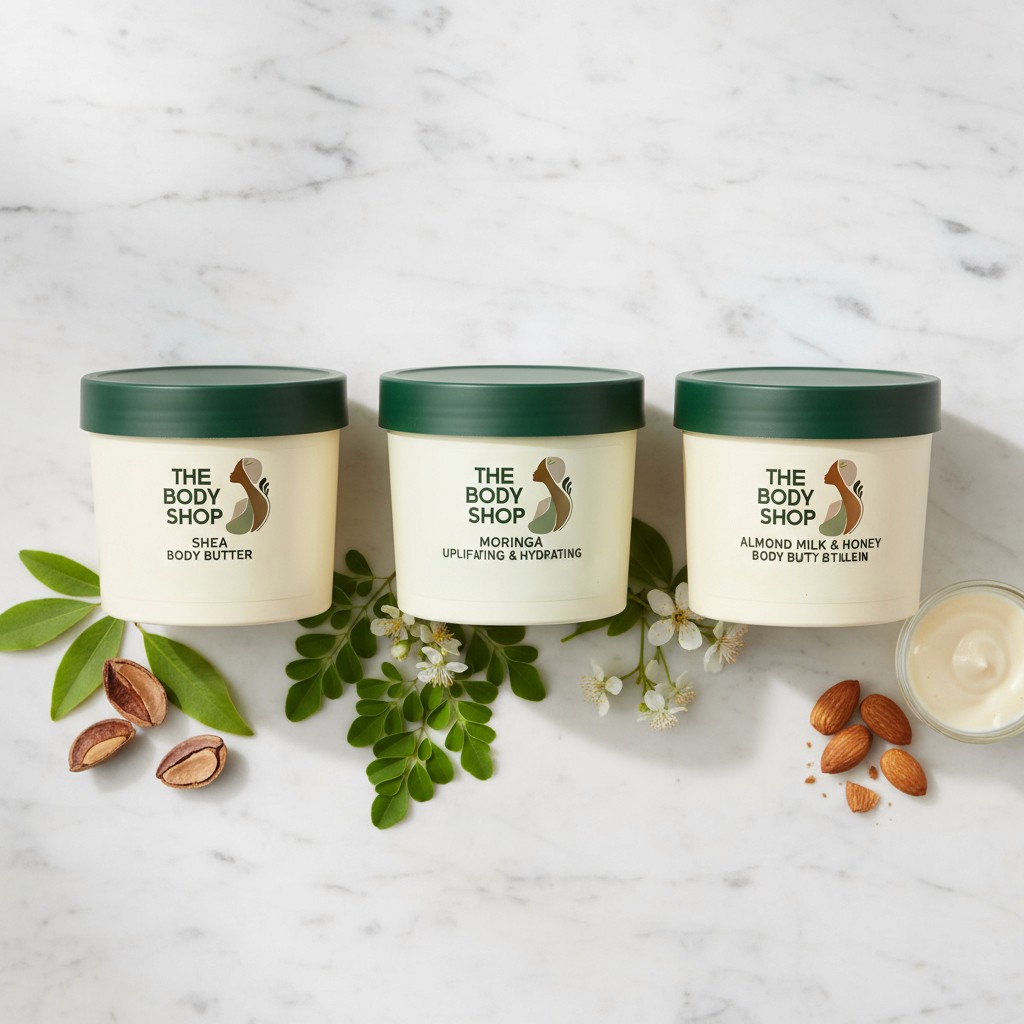
A conceptual rebrand of The Body Shop, developed from initial hand sketches through to final logo, packaging, and retail application. The new identity centres on a fluid female silhouette interwoven with botanical forms — communicating natural beauty, inclusivity, and ethical values through a refined visual language.

The brief was clear: a brand built on ethics and nature deserved an identity that actually looked the part.
The Body Shop has always stood for something bigger than beauty activism, sustainability, and community trade. But its visual identity had lost that conviction over time. This rebrand set out to strip away the noise and return to the brand's core: human, natural, and unapologetically purposeful. The mark combines a fluid female silhouette with organic botanical forms, creating a symbol that feels both modern and deeply rooted in what the brand stands for.


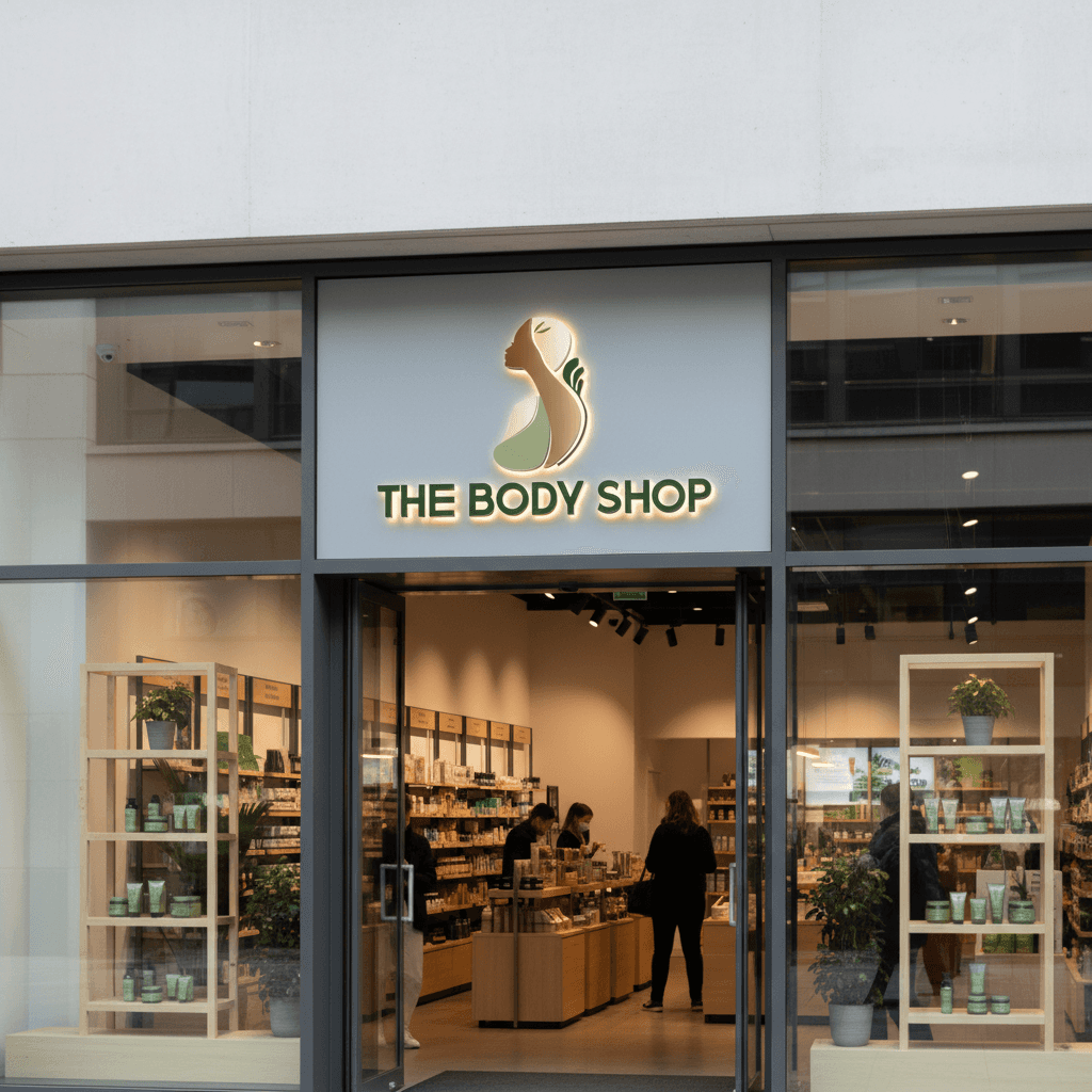
A mark that lives beyond the screen from sketchbook to shelf.
What started as a pencil on paper became a fully resolved brand identity tested across packaging, retail signage, and everyday touchpoints. The final system proves that good design doesn't need to shout. When the concept is right, the identity carries itself at any scale, in any context.
More Projects®

The Body Shop
A conceptual rebrand exploring how a global beauty icon could reconnect with its activist roots — through a cleaner, more confident visual identity.
UX
UI Design
A rebrand project to reconnect a global beauty brand with its roots through form, colour, and intention.®
Project Overview
A conceptual rebrand of The Body Shop, developed from initial hand sketches through to final logo, packaging, and retail application. The new identity centres on a fluid female silhouette interwoven with botanical forms — communicating natural beauty, inclusivity, and ethical values through a refined visual language.
The brief was clear: a brand built on ethics and nature deserved an identity that actually looked the part.
The Body Shop has always stood for something bigger than beauty activism, sustainability, and community trade. But its visual identity had lost that conviction over time. This rebrand set out to strip away the noise and return to the brand's core: human, natural, and unapologetically purposeful. The mark combines a fluid female silhouette with organic botanical forms, creating a symbol that feels both modern and deeply rooted in what the brand stands for.
A mark that lives beyond the screen from sketchbook to shelf.
What started as a pencil on paper became a fully resolved brand identity tested across packaging, retail signage, and everyday touchpoints. The final system proves that good design doesn't need to shout. When the concept is right, the identity carries itself at any scale, in any context.
More Projects®
The Body Shop
A conceptual rebrand exploring how a global beauty icon could reconnect with its activist roots — through a cleaner, more confident visual identity.
UX
UI Design
A rebrand project to reconnect a global beauty brand with its roots through form, colour, and intention.®
Project Overview
A conceptual rebrand of The Body Shop, developed from initial hand sketches through to final logo, packaging, and retail application. The new identity centres on a fluid female silhouette interwoven with botanical forms — communicating natural beauty, inclusivity, and ethical values through a refined visual language.
The brief was clear: a brand built on ethics and nature deserved an identity that actually looked the part.
The Body Shop has always stood for something bigger than beauty activism, sustainability, and community trade. But its visual identity had lost that conviction over time. This rebrand set out to strip away the noise and return to the brand's core: human, natural, and unapologetically purposeful. The mark combines a fluid female silhouette with organic botanical forms, creating a symbol that feels both modern and deeply rooted in what the brand stands for.
A mark that lives beyond the screen from sketchbook to shelf.
What started as a pencil on paper became a fully resolved brand identity tested across packaging, retail signage, and everyday touchpoints. The final system proves that good design doesn't need to shout. When the concept is right, the identity carries itself at any scale, in any context.